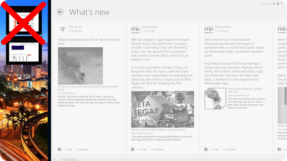
Windows 8.1: The good, the bad, the ugly
I am a huge fan of Windows 8, but I always acknowledged a few things were suboptimal in the way some things behaved. Let’s see if Windows 8.1 can do something to sort that out or not.
The good
Tabs and windows
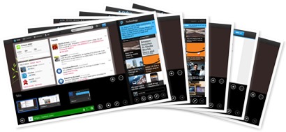
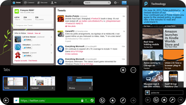
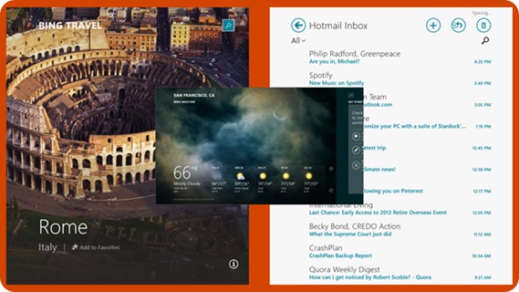
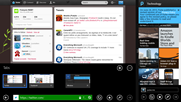 The new feature allowing applications to spawn multiple windows is awesome! Being able to see two PDF documents or two web pages side by side is really nice. You can transform any tab into a new window at any given time without having to reload the tab, like you’re used to do on the desktop.
Also, the way windows are handled in the first-party apps is really well though and intuitive: other windows are listed a “multi-tabs” and show a preview of the currently displayed tab in the window. Clicking on a window tab either open the window side-by-side if you were fullscreen, or replace the current window if you already were in side-by-side mode. This is very well done.
Another great thing is that you may now have more than 10 active tabs if you need it (that doesn’t happen a lot, but sometimes when you open “tabs for later” that may actually be useful).
Snapped view continuous resizing
The fact you can choose the exact size of the snapped app is also really nice, and the automatic zoom is implemented really well in the native apps. You may not have as much luck with third-party apps, however.
I find it at tad disappointing that apps cannot specify if they prefer “phone-like” or “50-50” display when snapped by default. For some apps, it just doesn’t make sense to be snapped “50-50” which is the default option, but that’s pretty minor.
Revamped control panel
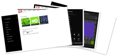
The revamped control panel is clear, easy to use and does almost anything you may want to tweak on your PC on a day-to-day basis.
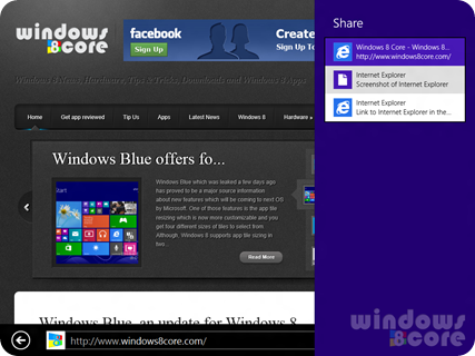
You can share screenshots again
In the early builds of Windows 8 you could share the screenshots of apps that didn’t have anything to share, but the feature eventually was removed. It’s back again.
Unified search
The unified search is great. Really, it took time before Windows could match what could be done on Mac with spotlight for ages, but now we can claim we have something even better. That’s really cool and it didn’t feel slow to use, which is actually important.

The bad
Very slow and uninformative install
Firstly, I was unable to install the app on my Asus VivoTab RT. Neither did anyone here in Belgium. The error message is cryptic and didn’t provide any help.
Secondly, installing the update on an unused laptop proved very, very long. In fact, the update took much more time to install than Windows 8 took in first place.
The installation progress is not assessable, you move from “Getting things ready (58%)” to “Applying PC settings (2%)” to “Getting things ready (17%)” again, after a reboot. You’ve no way to know what comes next, for how long you’ll be busy or to interrupt the process.
The Win-X menu is even bigger
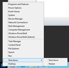
The Win-X menu (right click on the start button) is become bigger and bigger.
Seriously Microsoft, make some actually usable user interface for this “power-user” menu: that would make people who loved accessing admin stuff via the start menu happy.
It will also make my eyes much more happier every time I’ll use it. The absence of icons and the small font don’t help at all, I must say.
XBox Music is much faster, but…
It didn’t bring new features. I think Microsoft missed the opportunity to work on some very-much wanted usability improvements in the app.
You still can’t pin metro apps on the taskbar
At least, you need an app for that, and it doesn’t work perfectly.
The ugly
Where do you want to put this app?
Every time you open an app, Windows ask you at which side you want to open the app. That’s maybe okay if you have two apps open in 50-50 mode, but when you just have your primary app filling almost all the display and the Twitter app snapped in phone-like mode, this is painfully annoying to have to click on the left side of your screen every time you open an app. You wouldn’t want to open a new app in snapped view, right?
When it proposes you to open the settings panel on right side, it gets laughable.
You can’t snap the desktop anymore
This is really annoying. The desktop must take at least 40% of your screen or else is vanishes. On Windows 8, when the desktop was snapped, it showed a live preview of every active window. This is really nice if you have to watch a video via Silverlight but want to continue working with metro apps while being able to see a small picture of the video.
This was also very welcome when you’re doing file transfer operations, you could follow the progress in snapped mode in real time, while still doing other stuff.
You can’t remove the start button
That’s really stupid. And it’s even more stupid when you don’t put your taskbar at the bottom of your device like me, because the start button isn’t even on the right place, so you end up having two start buttons on the PC (the corner-based one, and the taskbar one). Not really smart.
Hopefully this is due in the final version and was not included in this build because the start button itself was included very few time before the preview build.
(new) Search isn’t ubiquitous anymore
In Windows 8, you could search in any app. In Windows 8.1 you can only search the current app or the apps that support direct search results. That means you can’t search for the map of an address by typing it in the search box or use the Box app to search a file without opening the app first. That’s a disastrous regression, as some of my friends noted.
