Element Media Queries (:min-width)
On the eve of HTML Web Components, and of stronger than ever Responsive Design requirements, the need for Element Media Queries is becoming very visible. This blog post will try to make a case for a JavaScript prollyfill and gives some background on why the :min-width pseudo-class is so difficult to implement.
If you’re not interested by the technical reasons of why :min-width and :max-width are difficult to implement, you can skip to the ‘Prollyfill’ headline.
Width computation algorithm
In CSS, the width of an element is rarely straightforward to compute. Most of the times, the mental model people use is that the width of an element depends on the width of its ancestors. A very straightforward example of this property would be the following code:
<div style="width: 300px">
    <div style="width: 50%">Some text</div>
</div>
However, even this code is not as straightforward as it may seem. Depending on whether the outer div was included in flexbox or a grid container or if the inner div is given an absolute position, the results may vary highly.
If you consider a flexbox or a grid, for example, the final width of an element depends on the width of all the previous AND next sibling elements. Worse, the size of the sibling elements can itself depend on the minimum size of all their child elements (here: text nodes), as can be seen with this example:
<div style="width: 300px; height: 100px; background: red;
            display: grid; grid-rows: auto 1fr; grid-columns: auto 1fr;">

    <div style="background: green; grid-column: 2; grid-row: 2;">
        Some text
    </div>


    <div style="background: blue; grid-column: 1; grid-row: 1;">
        Some other text
    </div>

</div>
And here’s the rendering in Internet Explorer:
So, we have seen the final size of an element can depends on its own children minimum size, on its siblings and their children’s minimum size, on its parent size and, recursively, on almost all the other elements in the page.
Of course, browsers do a great job of optimizing this and every time this is possible, they will try to decouple the layout passes into independent segments. But this is not possible in the general case.
Layout computation
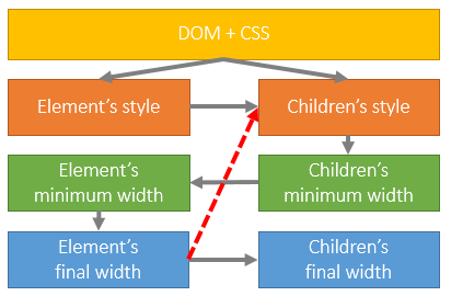
Because a picture is worth thousands words, here’s a schema explaining how the layout of an element is computed (for the sake of simplicity, let’s suppose we work on the root element):
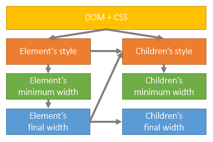
Basically, the style of the element and all his children is being computed (the style of the children depends on the style of the parent because of the ‘inherit’ keyword). Then, the minimum size of every element is computed, bottom-up. Based on this information, the real size of the parent element is computed and, subsequently, the final size of all its children, top-down.
Now, let’s imagine for a second that we have a :min-width pseudo-class. To make it work, we would need the Children’s style to depend on the Element’s final width. However, we can clearly see how the size of an element depends on the minimum size of its children, which depends on the style applied on the children.
We just formed a cyclical dependency which is very hard to track down. Even worse, don’t forget that finding the width of an element may require computing the min-width of all elements on the page. Imagine how much computations would be done for nothing if to determine if a style match we had to suppose the style don’t match to compute an initial final width and apply the CSS rules based on this fictive final width (and repeat until we reach a stable state).
Finally, this is not an option because it would create a huge dependency between the CSS Matching and the Layout subsystem, something that’s clearly suboptimal and could create huge bottlenecks and difficulties to parallelize computations.
Resolving the conflict
As for every conflict, there are multiple ways to fix the issue, each with their own tradeoffs. In CSS, until now, the conflict has been solved by not allowing the style to depend on the actual layout. However, different needs may require different tradeoffs.
The other option would be to make sure the element’s size doesn’t depend on the element’s content as that would allow the children’s style to depend on it without conflict.
This is what I personally call “staged layouts”: we can clearly see how the first stage of the layout (the element and its ancestors) are done in a single pass, and then how the children themselves are computed in a second layout pass.
Staged layouts has some disadvantages, but also many virtues. I’m totally convinced that staged layout will be supported in the future by browsers to solve performance issues like infinite scrolling lists [1].
Iframes and media queries
It’s interesting to note that browsers already support a kind of staged layout: iframes. Inside an iframe, you can use normal media queries and style the inner document using the iframe size. This is possible because no element of the inner document can have any impact on the size of the iframe.
The problem with iframes is that they are quite heavy, because they require a new document, a new scripting environment, and a lot of memory allocations. Additionally, events are not fired transparently across iframe borders.
So, using iframes may be useful in some specific cases but the tradeoffs are quite difficult to manage and generally require using a framework to abstract the cross-frame communications issues.
The Viewport element
The idea of the viewport element would be to create a similar layout isolation, but without creating a new document like an iframe. A viewport element would have the following properties:
- The size of a viewport doesn’t depend on the size of its children. That means you have to set the width and height properties of the viewport yourself most of the times (or you may rely on a grid of a flexbox to compute it for you). It’s possible that a seamless attribute will help you work with automatic height calculation.
- The content of a viewport is automatically clipped at the viewport dimensions. Whether it’s the content box or the margin box, it will be similar to how an iframe hides the invisible content that can’t fit inside its dimension.
- The viewport position must be either ‘relative’ or ‘absolute’. That means that every element inside the viewport will be positioned relatively to the viewport’s area, not the top document.
- The viewport element will fire ‘onresize’ events, like an iframe does.
- Some CSS features, like CSS Regions, will not work across viewport boundaries.
The viewport element, because of its particularities, will be able to respond to the “:min-width” and “:max-width” pseudo-classes, and possibly some more like “:media”. I believe it will therefore solve the issues currently faced by the CSS community.
viewport.file-explorer:max-width(480px) .file {
    // adapt to a small viewport
}
The :min-width prollyfill
However, the <viewport> element and the “:min-width” pseudo-class aren’t going to be introduced in the coming days. It will probably take time to track the subtle layout-styling interactions. Therefore, if you need to use “:min-width” today, you’ll have to use a prollyfill (ie: a speculative polyfill).
Hopefully for you, I created such a prollyfill based on the work of Mozilla’s Daniel Buchner and Hitch’s Brian Kardell.
viewport.file-explorer:-js-max-width(480) .file {
    // adapt to a small viewport
}
However, I would like to point out that a JavaScript code can’t access the internals of the browser CSS engine and will slightly degrade your onload performance; probably not as notably as a less-efficient code you could use to detect resizes, but still.
I would therefore encourage you to adopt an “it should work without the prollyfill” approach where you site isn’t totally broken if the prollyfill stop to work.
I would also encourage you to use the “:-js-min-width” pseudo-class on <my-viewport> elements only and, to force you avoiding possibly costly work for the browser, define <my-viewport> to work under similar-to-real-viewport conditions, ie:
my-viewport {
    position: relative;
    width: 0px;
    height: 0px;
    overflow: hidden;
}
You might even want to wrap your viewport content inside a wrapper like this:
.viewport-wrapper {
    position: absolute;
    top:0;left:0;right:0;bottom:0;
    transform: translate(0px,0px);
}
The advantage of this technique is that it make sure the size of your viewport will never depend on the size of its children. This is not technically required, but this could help keeping your site super responsive in case it’s dynamic.
The prollyfill itself will parse your CSS stylesheet and replace occurrences of the pseudo-class by an unique CSS class. When an element matches your selector except the pseudo-class, a code will be executed to see if the pseudo-class matches and will listen to the ‘onresize’ event of the element (or a polyfill for non-IE/Opera browsers) to update the class when the element changes of size.
For more details, I encourage you to read the related sources listed at the end of this blog post.


