Modern CSS: Examples and best practices (1)
In this series, I’ll explore some common web layouts and show how modern layout technologies allow you to achieve them using a semantic markup. In this first blog post, I’ll work on the facebook layout.
The Fixed-Position Biased-Centering
You may like it, love it or hate it, but you get to admit Facebook is an ubiquitous website: even the people who decided not to use it have probably seen it in action recently anyway. In my first case study, I’ll therefore talk about an interesting feature of the facebook design, and how you would reproduce it using modern layout technologies. Okay, let’s start now!
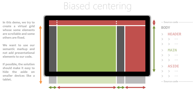
The facebook website features a fixed header and a pane docked to the right side. On the other hand, the main content has a fixed width, is centered horizontally inside the remaining free space of the page, and follows the natural document scrolling.
To sum up: in this demo, we try to create a virtual grid whose some elements are scrollable and some others are fixed. We want to use our semantic markup and not add presentational elements to our code. If possible, the solution should make it easy to hide the aside on smaller devices like a tablet.
General considerations
Before writing any code, let’s focus on the constraints. Firstly, it’s clear the BODY element has to be a block element because we want the scroll behavior to work. Then, the header and the docked pane will have to have a fixed position; either a fully-fixed or a sticky position.
Using flexible boxes
Given we only need one row of inline content, a good solution would be to transform our BODY element into a flex box. The remaining issue is the biased centering. A first solution would be to align the content perfectly then translate it horizontally, but this is an hacky solution.
A better option would be to prepend a column after and before the main content. This is my preferred flex-based solution because you don’t need actual markup to achieve this result:
.root-container {
display: flex;
}
.root-container::before,
.root-container::after {content: ''; display: block; flex-grow: 1;
}
.root-container::after {
flex-basis: 200px;
}
At this point, every inline element that will included inside the body element will be centered in the “100vw - 200px” space which remains available inside the root container.
I also like the fact I can reuse the same class/mixin for the header, which also need the same biased horizontal centering.
If we want the multiple elements inside that header space to fill the available space until a max-width, we will need to wrap those into a NAV element which will itself be a flex element. For the main content, we can use a MAIN element for that purpose.
body > main, header > nav {
max-width: 960px;
}
At this point, the header and the docked pane can simply be put in the BODY, positioned in a fixed way at the right location of the screen. That way, they won’t take part in the flexible layout.
body > header {
position: fixed;
top: 0px; right: 0px; width: 100%;}
body > aside {
position: fixed;
top: 40px; bottom: 0px; right: 0px; width: 200px;}
That’s it. Because our html is not influenced by our layout, we can simply decide to create a new one for other viewport sizes ![]()
Using grids
Another, even more modern option would be to use a real grid to define our layout. Given we want the header and the docked pane to stay fixed, we will have to trick the browser by setting a “position: sticky” on them at their initial vertical location, to fix them there.
In this case, we define a 4-by-2 grid like this:
body {
display: grid; min-height: 100%;
grid: 1fr 960px 1fr 200px /
'..... HEAD ..... ..... ' 40px
'..... MAIN ..... ASIDE ' 1fr;}
And we have to set “position: sticky” on the fixed elements:
body > header {
grid-area: HEAD;
position: sticky;
top: 0px;}
body > aside {
grid-area: ASIDE;
position: sticky;
top: 40px;}
I like this method better, but it isn’t working in any browser at this time, sadly.
Conclusion
I think modern css made it really much easier to define layouts in a intuitive and semantic way and I’ll come back in two weeks with new interesting modern css best practices to continue to prove it. In the mean time, what do you think?
